Feng Shui Home
The Harmony of Feng Shui in Design
Originating in China about 6,000 years ago, Feng Shui is a practice that translates to “wind and water.” Its goal is to design and plan buildings and their surroundings for harmony and happiness. Feng Shui encourages organizing objects to allow the flow of natural energy, which is believed to move through spaces and living beings. It acknowledges the impact of a building’s layout, colors, and materials on this energy flow.
Core Principles of Feng Shui Design
Feng Shui design is based on three core principles: allowing energy to flow, balancing natural elements with attributes such as color, texture, and shape, and placing objects representing one’s life journey within a space. Interestingly, there is a noticeable overlap between Feng Shui and what Westerners might call “good design,” which includes sunlight access, air and ventilation, natural light balance, indoor-outdoor relationships, comfort, privacy, material balance, and organization.
Design Decisions Based on Feng Shui Principles
Let’s discuss our design decisions for a home, which were a series of small and considered moves based on the study of Feng Shui principles.
Gradual Revelation
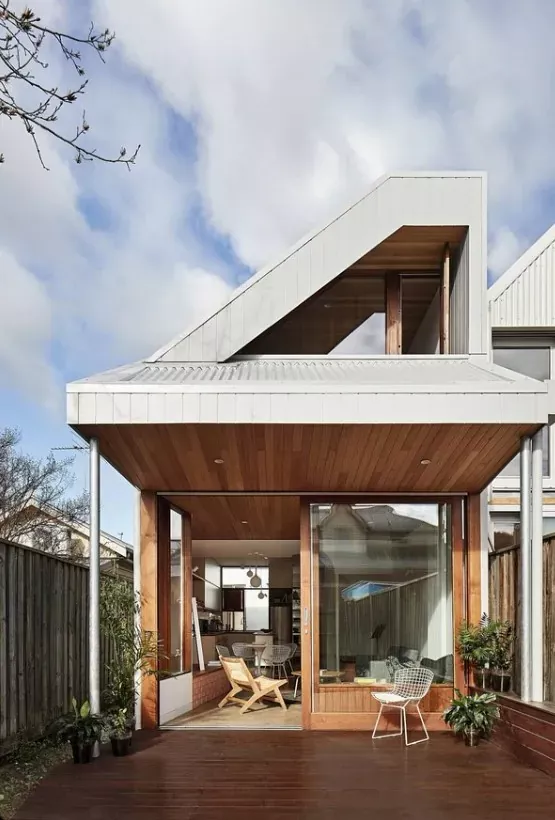
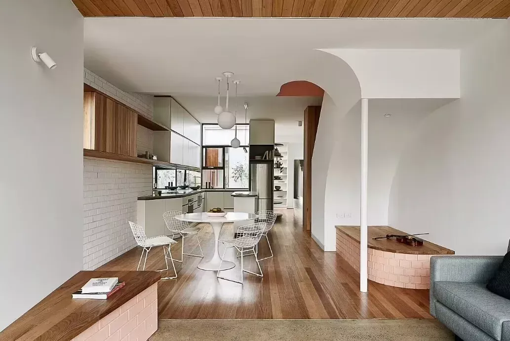
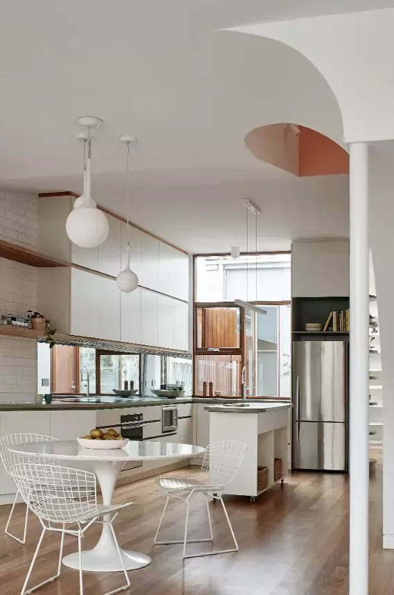
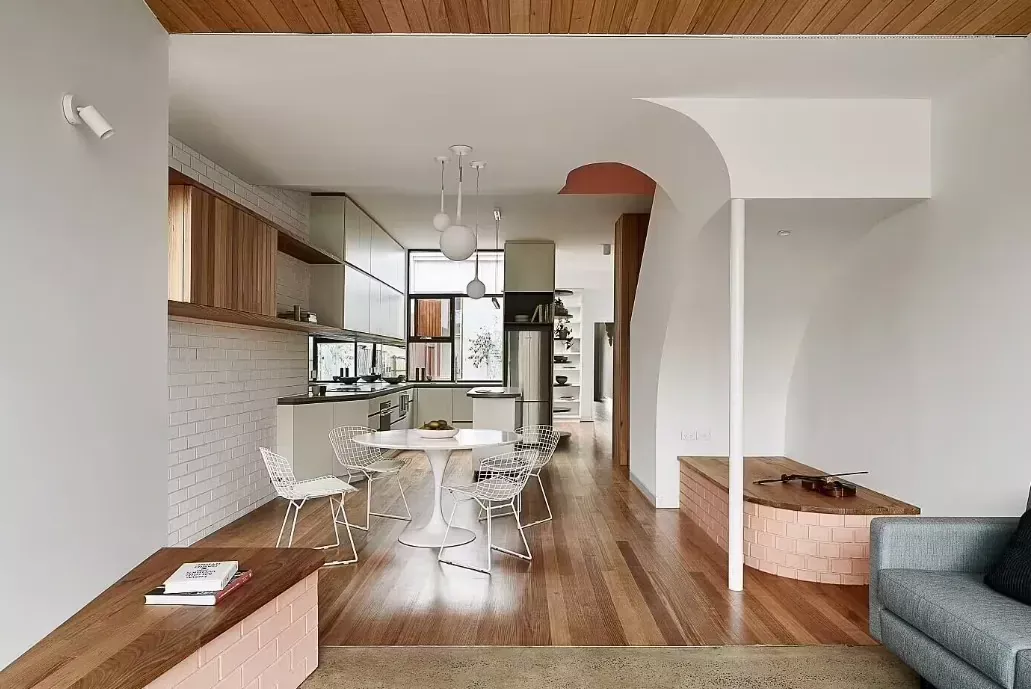
We restored the old terrace and added a new curved timber wall at the end of the hallway, which serves as both a link between the old and new sections and a barrier to the street. We separated the extension with a courtyard to allow sunlight into the old house and provide natural light and ventilation for the new one. The hallway linking the terrace and extension was widened to accommodate a study with outdoor access. The curved timber wall, enclosing a store, leads into the kitchen designed to welcome visitors upon arrival while overlooking the courtyard and study.
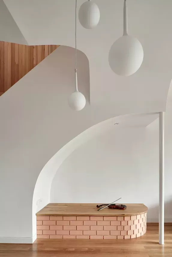
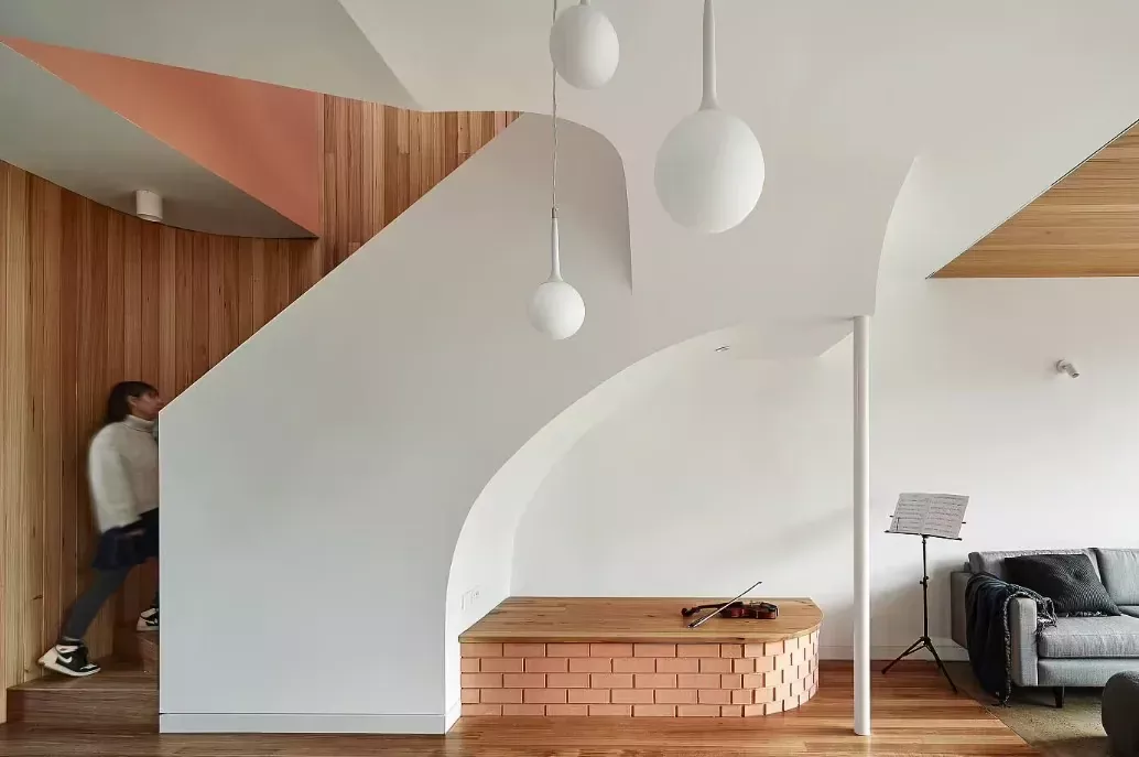
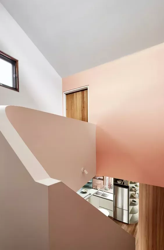
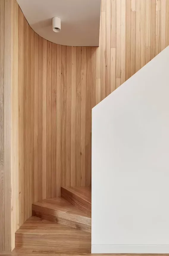
Behind the store, a stair void appears. The back is colored, reflecting light into the space below. Color and materials reveal themselves gradually, a design move often employed by Mexican architect Luis Barragan and one of my favorites.
Engaging Dining Space
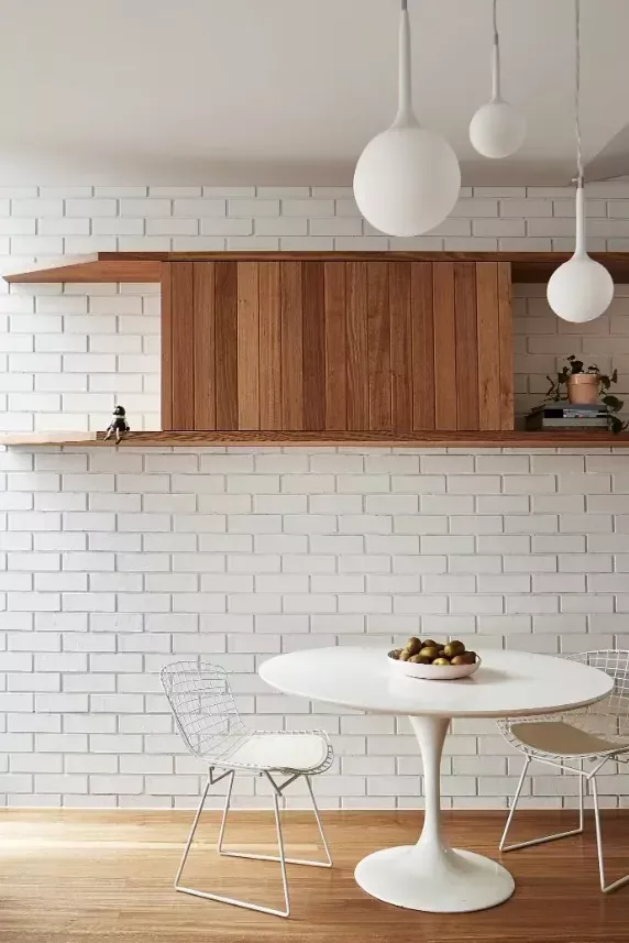
Between the stair and kitchen, we placed the dining room – a busy, engaging, and open space designed to encourage conversation. The timber floor of the dining area continues into the ceiling of the adjacent lounge, a retreat with a sense of calmness that looks back into the house, courtyard, and out into the garden.
Balancing Shelter and Views in Upstairs Rooms
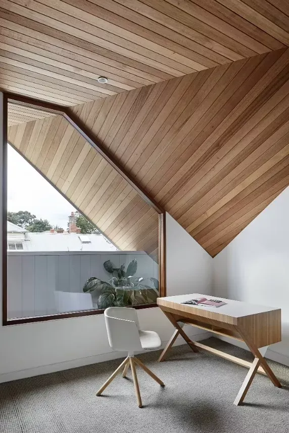
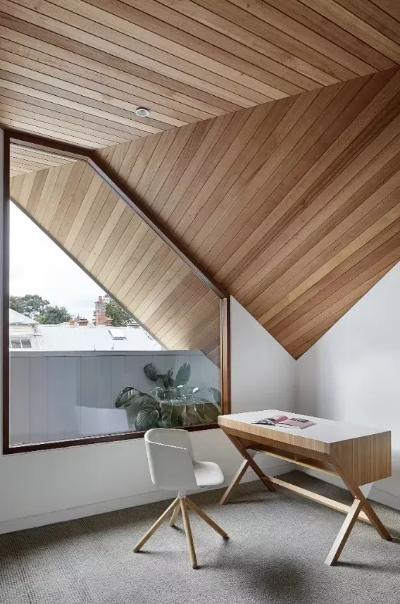
The upstairs rooms, more exposed to sun, wind, and rain, are designed and finished to achieve a balance between shelter from the elements and exploring views into the distance.
Premeditated Coincidence
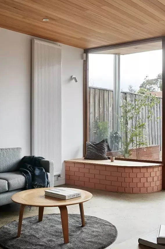
The best form of interaction is coincidental, and the skill lies in planning the coincidence. Some layout and design decisions, such as brick platforms for seats facing the dining space or lounge, were made to facilitate interaction.
Subtle Contradictions
For an economical house on a narrow block, a compact footprint seems logical. However, logical is not always best. We skewed and stretched the lounge room walls to draw sunlight and the garden into the dining room. The stairwell forms a large void, prioritizing space over utilities. It may appear oversized, but the benefits are evident: the stair creates a light-filled and generous living space on a small footprint.


